StackedCardsView 堆叠视图效果
效果图如下
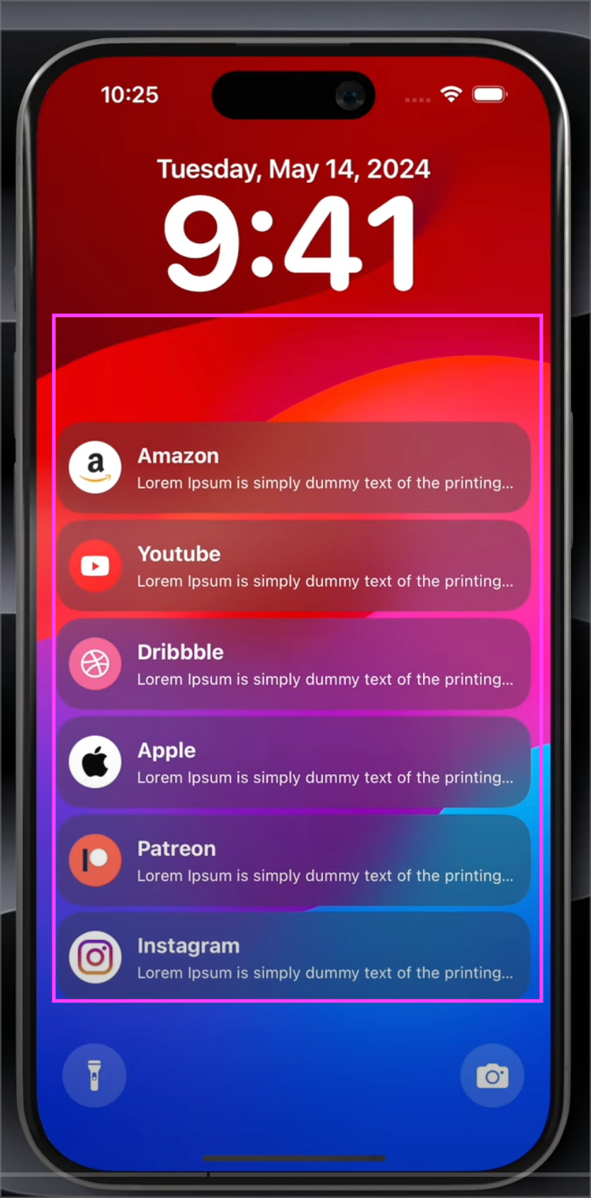
如图- 分为上中下三部分, 最重要的是中间部分堆叠视图效果制作围绕这块。
1
2
3
4
5
6
7
8
9
10
11
12
13
14
15
16
17
18
19
20
21
22
23
24
25
26
27
28
29
30
31
32
33
34
35
36
37
38
39
40
41
42
43
44
45
46
47
48
49
50
51
52
53
54
55
56
57
58
59
60
61
62
63
64
65
66
67
68
69
70
71
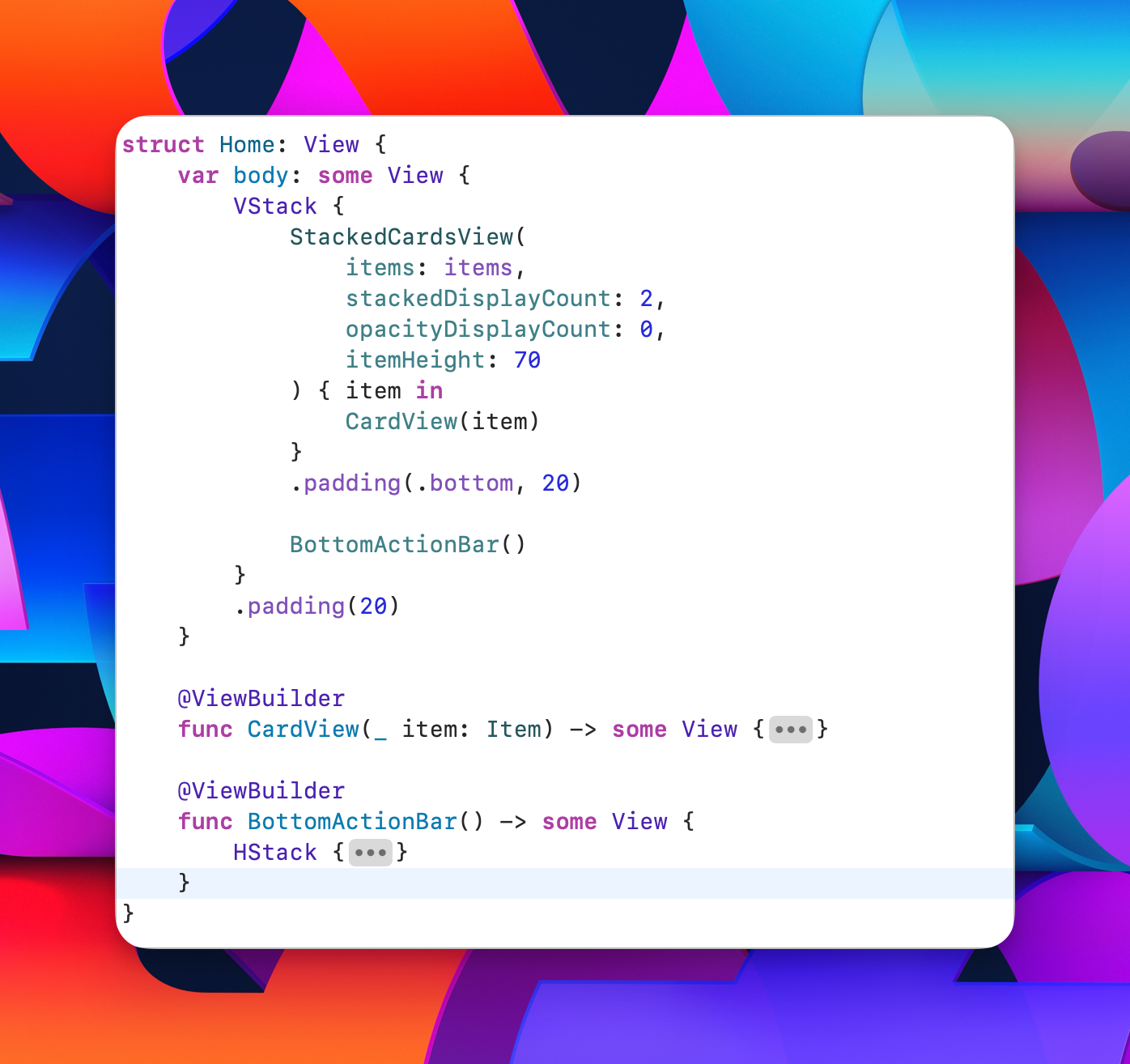
| struct Home: View {
var body: some View {
VStack {
StackedCardsView(
items: items,
stackedDisplayCount: 2,
opacityDisplayCount: 0,
itemHeight: 70
) { item in
CardView(item)
}
.padding(.bottom, 20)
BottomActionBar()
}
.padding(20)
}
@ViewBuilder
func CardView(_ item: Item) -> some View {
if item.logo.isEmpty {
Rectangle()
.fill(.clear)
} else {
HStack(spacing: 12) {
Image(item.logo)
.resizable()
.aspectRatio(contentMode: .fill)
.frame(width: 35, height: 35)
VStack(alignment:.leading, spacing: 4) {
Text(item.title)
.font(.title3.bold())
Text(item.description)
.font(.caption)
.lineLimit(1)
}
}
.padding(10)
.frame(maxHeight: .infinity)
.background(.ultraThinMaterial)
.clipShape(.rect(cornerRadius: 20))
}
}
@ViewBuilder
func BottomActionBar() -> some View {
HStack {
Button(action: {}, label: {
Image(systemName: "flashlight.off.fill")
.font(.title3)
.frame(width: 35, height: 35)
})
.tint(.white.opacity(0.2))
.buttonStyle(.borderedProminent)
.buttonBorderShape(.circle)
Spacer(minLength: 0)
Button(action: {}, label: {
Image(systemName: "camera.fill")
.font(.title3)
.frame(width: 35, height: 35)
})
.tint(.white.opacity(0.2))
.buttonStyle(.borderedProminent)
.buttonBorderShape(.circle)
}
}
}
|
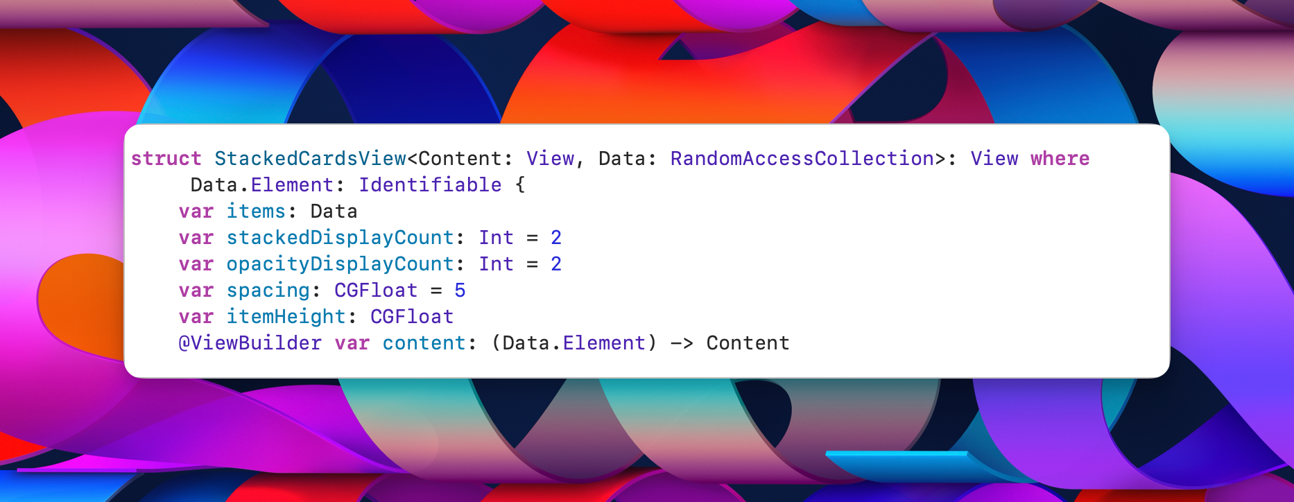
StackedCardsVeiw封装
1
2
3
4
5
6
7
8
| StackedCardsView(
items: items,
stackedDisplayCount: 2,
opacityDisplayCount: 0,
itemHeight: 70
) { item in
CardView(item)
}
|
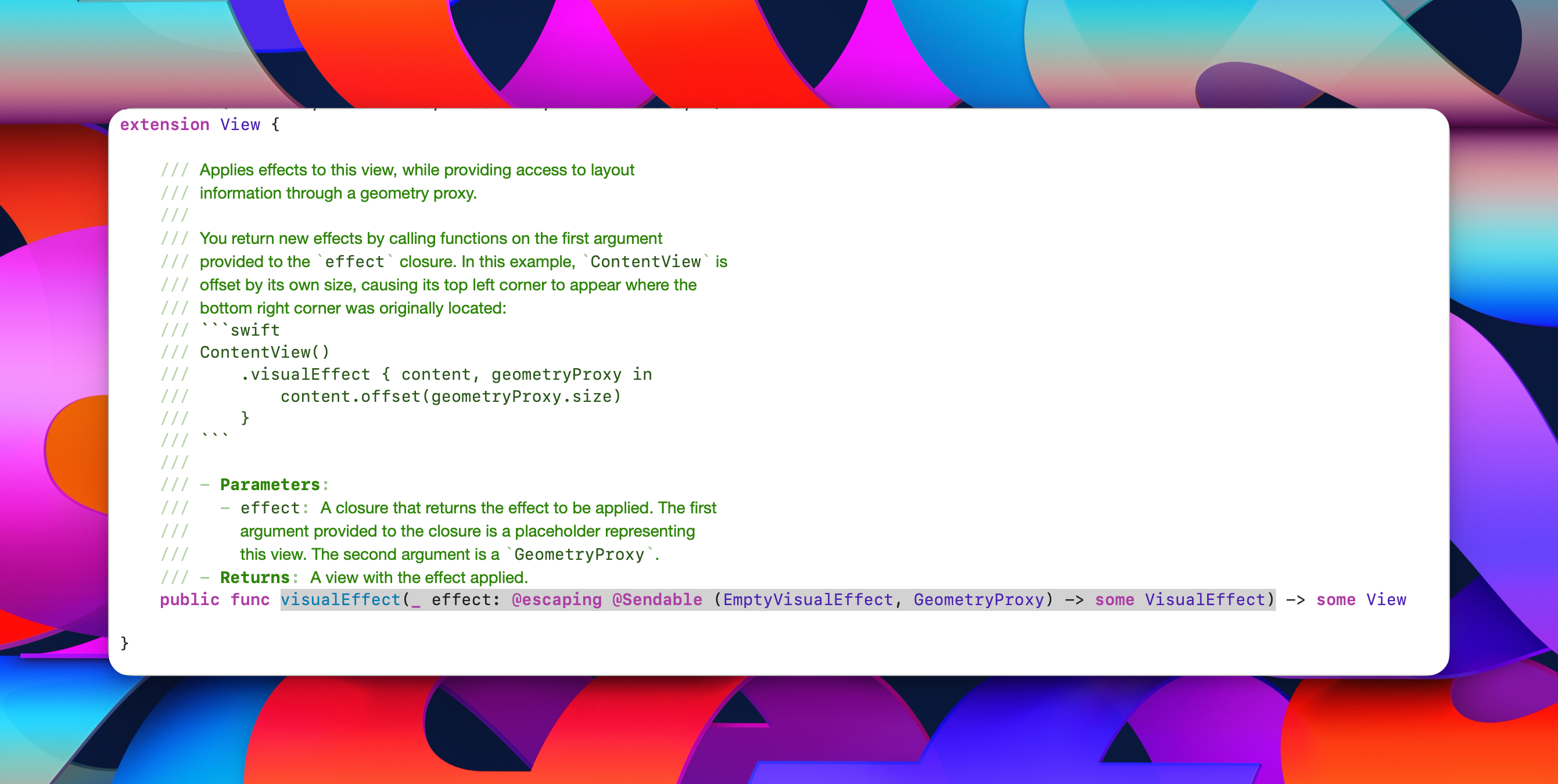
外部可提供参数**
数据 items,stackedDisplayCount堆叠视图显示个数 opacityDisplayCount 不透明显示个数 itemHeight每个card高度, spacing间距
最重要的尾随闭包 { item in xxx} 作为外部实现提供的card具体内容, 内部负责处理排版显示效果。
进入内部
垂直滚动视图不显示滚动条, 且伴随向下滑动至底部堆叠在一起, 可根据参数opacityDisplayCount显示堆叠后可显示个数
1
2
3
4
5
6
7
8
9
10
11
12
13
14
15
16
17
18
19
20
21
22
23
24
25
26
27
28
29
30
| var body: some View {
GeometryReader {
let size = $0.size.height
let topPadding = size - itemHeight
ScrollView(.vertical) {
VStack(spacing: spacing) {
ForEach(items) { item in
content(item)
.frame(height: itemHeight)
.visualEffect { content, geometryProxy in
content
.opacity(opacity(geometryProxy))
.offset(y: offset(geometryProxy))
.scaleEffect(scale(geometryProxy), anchor: .bottom)
}
.zIndex(zIndex(item))
}
}
.scrollTargetLayout()
.overlay(alignment: .top) {
HeaderView(topPadding)
}
}
.scrollIndicators(.hidden)
.scrollTargetBehavior(.viewAligned(limitBehavior: .always))
.safeAreaPadding(.top, topPadding)
}
}
|
topPadding用于参与计算实现时间区域pin在顶部位置. 还用来将这些卡片堆叠后显示在滚动视图的底部, 保持和iPhone通知中心效果一致.
堆叠效果?
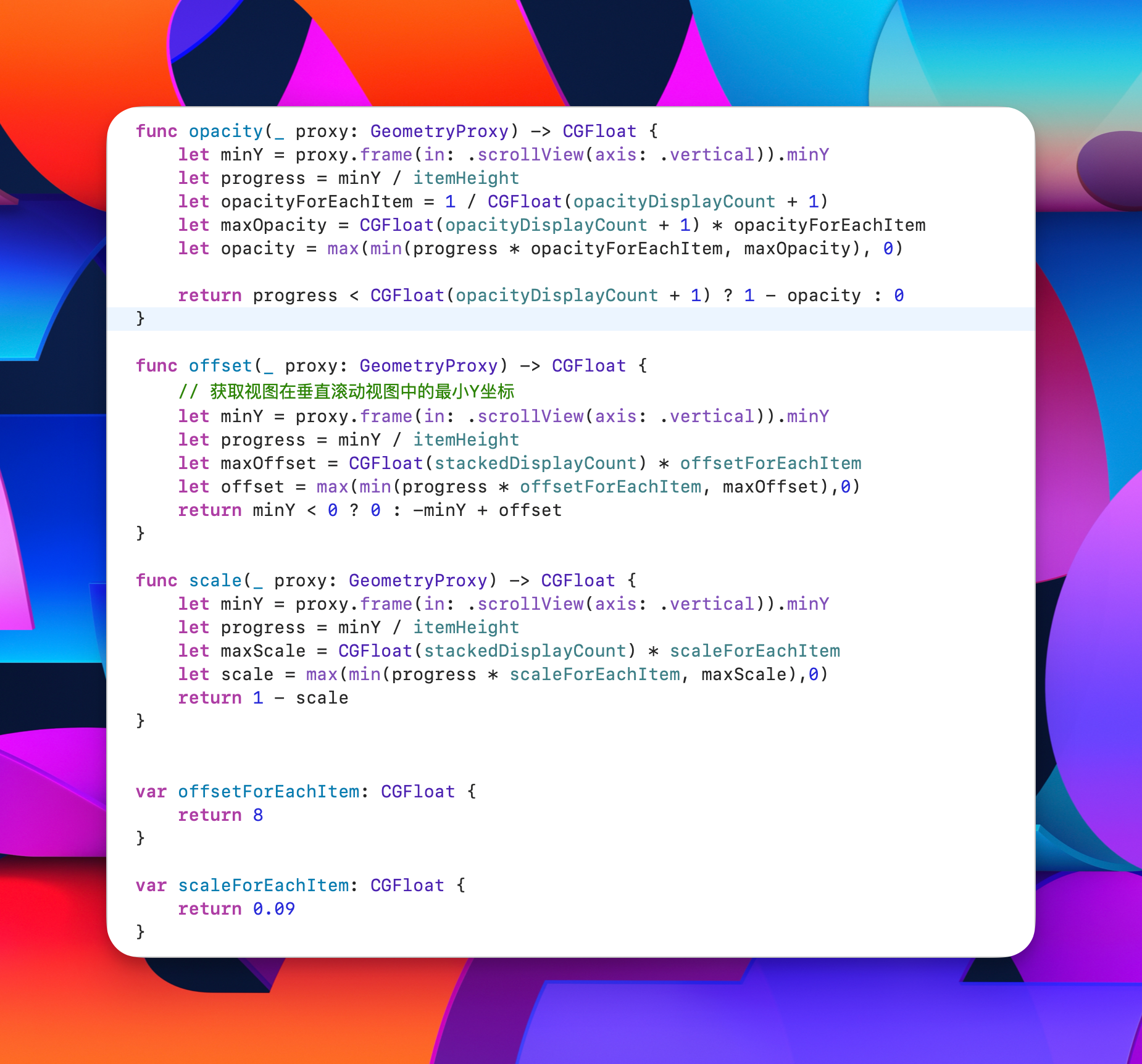
修饰符: .visualEffect
1
2
3
4
5
6
| .visualEffect { content, geometryProxy in
content
.opacity(opacity(geometryProxy))
.offset(y: offset(geometryProxy))
.scaleEffect(scale(geometryProxy), anchor: .bottom)
}
|
.offset(y: offset(geometryProxy)) 用于计算Y轴上的偏移
1
2
3
4
5
6
7
8
9
10
11
| func offset(_ proxy: GeometryProxy) -> CGFloat {
let minY = proxy.frame(in: .scrollView(axis: .vertical)).minY
let progress = minY / itemHeight
let maxOffset = CGFloat(stackedDisplayCount) * offsetForEachItem
let offset = max(min(progress * offsetForEachItem, maxOffset),0)
return minY < 0 ? 0 : -minY + offset
}
var offsetForEachItem: CGFloat {
return 8
}
|
通过minY可获取到视图在垂直滚动视图中的最小Y坐标,也就是顶部距离Y轴上的最短距离.
progress判断在堆栈中的位置, maxOffset 和 offset用于计算堆叠在一起的cards偏移量要显示的stackedDisplayCount 分别有8间距的距离依次靠上一点, 其余的都在一个位置那就是maxOffset 靠下边堆叠在一起.
等到 minY < 0 ? 0 : -minY + offset 就可以看出向上滚动不加便宜正常滚动视图中的cards, 向下滚动就会显示偏移在-minY + offset的位置, 也就是堆叠在一起了. ( 根据计算结果相对偏移 )
至于opacity 和 scale效果同理. 只有时间区域pin顶部吸顶效果有所不同
让堆叠视图显示在下方?
使用topPadding 让滚动视图的整体高度去掉每个card的itemHeight ( 由外部使用者提供 ) , 给scrollview添加safeAreaPadding(.top, topPadding) 如此堆叠视图本来是在顶部显示, 由于添加了内容padding, cards区域就可以显示在底部了.
根据offsetY的计算, 此时向上滑动视图, 由于此时minY < 0 效果是正常展开滚动每个card , 不受影响.
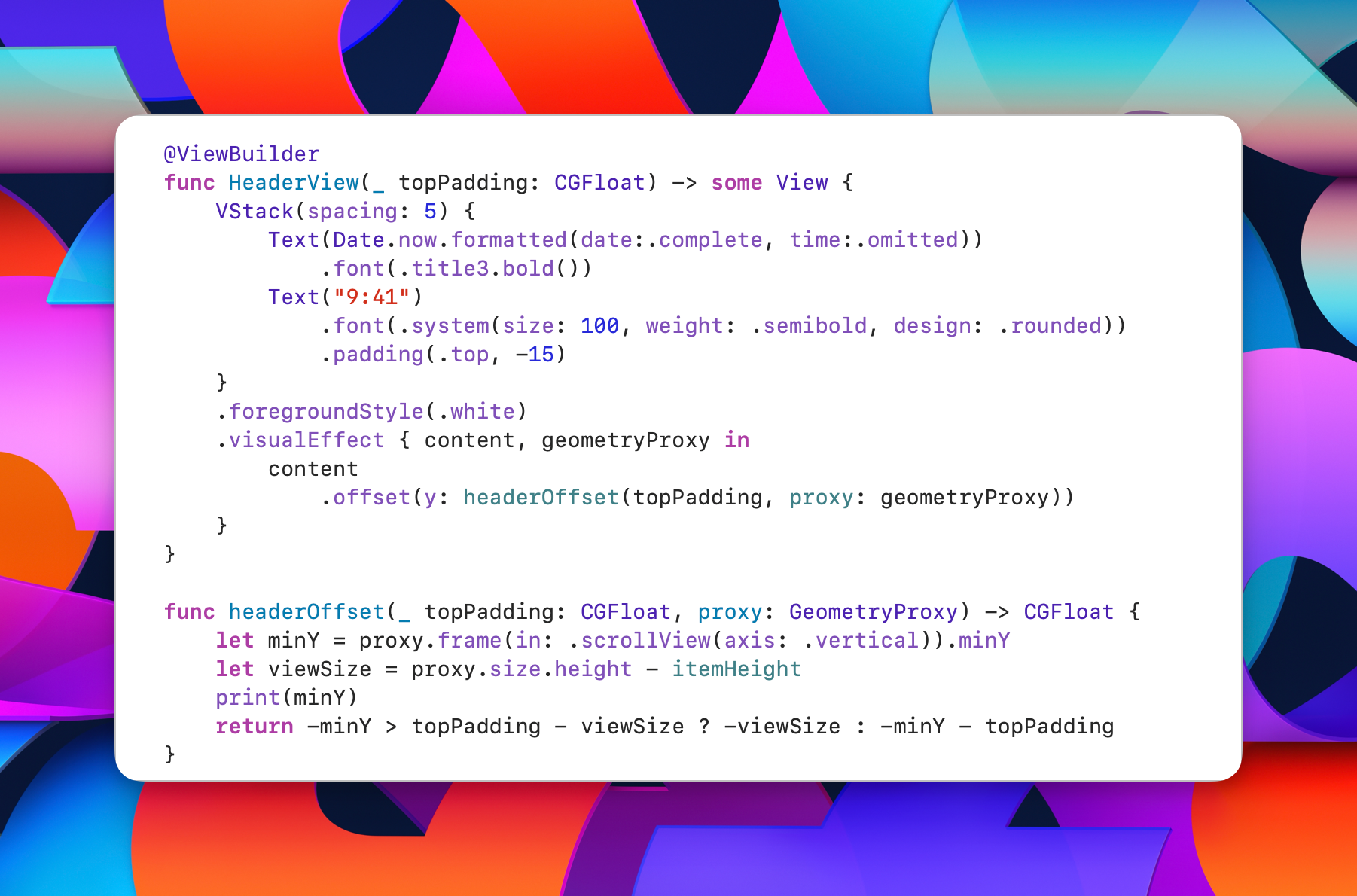
到这里效果, 就差不多了 , 最后剩一个时间区域 动态pin在顶部位置 < 称为 HeaderView>
同理也是在视图中添加修饰符.VisualEffect
1
2
3
4
5
| func headerOffset(_ topPadding: CGFloat, proxy: GeometryProxy) -> CGFloat {
let minY = proxy.frame(in: .scrollView(axis: .vertical)).minY
let viewSize = proxy.size.height - itemHeight
return -minY > topPadding - viewSize ? -viewSize : -minY - topPadding
}
|
-minY > topPadding - viewSize意思是cards上滑处于时间区域的下方临界位置还在上滑 ( 则显示HeaderView偏移到cards的上方跟着一起滑走 ), 如果没超过这个临界值( 比如: 下滑又回来了并且在headerview下方还在向下滚动 ) headerview则根据-minY - topPadding 动态定在顶部那个地方不动 ;
就是说 在时间区域下方来回游走, 时间不动, 超过时间区域底部继续上滑则跟着cards最顶部( 偏移量-viewSize ) 随着外部scrollView一起滚动, 随即在屏幕上消失 .